Choose a ready-made theme
A theme is a set of colours and a pair of fonts that belong together. Choosing one is the quickest way to make the site look like your choir. You can then change the colours or the fonts separately.
The Theme section of Site Settings is not a form like the others. It is a picker with five parts, from top to bottom:
| Part | What it does | Explained in |
|---|---|---|
| Start from a theme | Sets colours and fonts together | This page |
| One colour | White pages with one colour of yours | Change your colours |
| A palette of four colours | A dark, coloured look | Change your colours |
| Fonts | The lettering | Change your fonts |
| Preview | Shows the result before you save | Below |
On a self-hosted site, a Site Admin sees a sixth part, Custom style sheet: see Add a custom style sheet.
How the parts fit together
A theme is a shortcut, not a setting of its own. Selecting a theme's card does two things at once: it selects one of the colour choices further down, and it selects one of the font pairings. Only those two choices are saved.
So you can pick the nearest theme and then change either half. If you do, no card says Chosen any more, because your combination is no longer one of the fifteen. Nothing is wrong: your site simply has its own mix.
Choose a theme
- Go to Site Settings → Theme.
- Under Start from a theme, select a card. Each shows the theme's name on its own colours, with a line saying who it was made for. The chosen card has a darker border and its line begins with Chosen.
- Look at the Preview further down the page.
- Select Save.
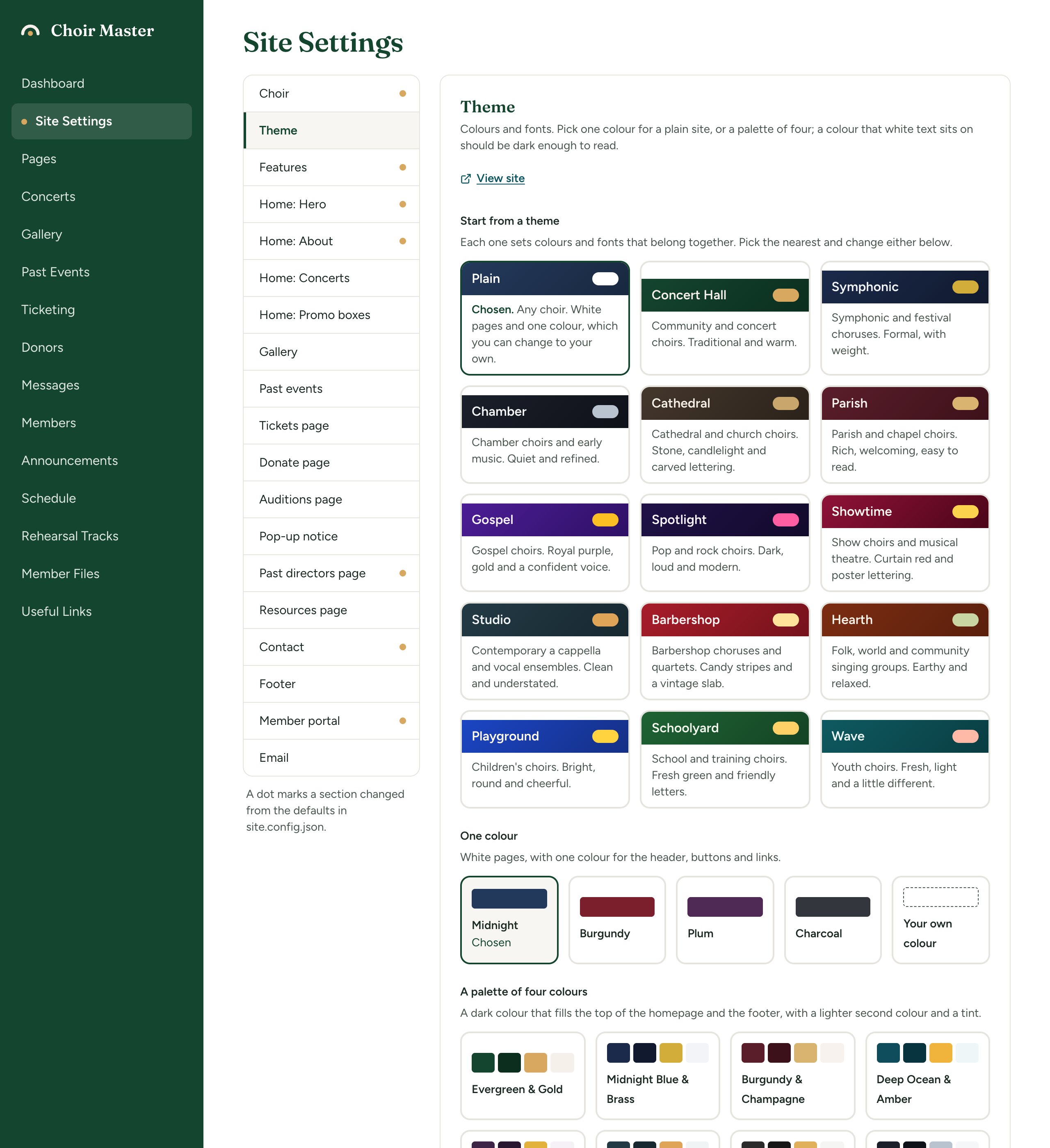
Until you save, nothing on your site changes. Discard changes puts the picker back to what your site has now.
The fifteen themes
A new site starts on Plain. The guided setup suggests one of the others when you say what kind of choir you are.
| Theme | Made for | Colours | Fonts |
|---|---|---|---|
| Plain | Any choir. White pages and one colour, which you can change to your own. | Midnight (one colour) | Plain |
| Concert Hall | Community and concert choirs. Traditional and warm. | Evergreen & Gold | Classic |
| Symphonic | Symphonic and festival choruses. Formal, with weight. | Midnight Blue & Brass | Editorial |
| Chamber | Chamber choirs and early music. Quiet and refined. | Ink & Silver | Elegant |
| Cathedral | Cathedral and church choirs. Stone, candlelight and carved lettering. | Stone & Candlelight | Liturgical |
| Parish | Parish and chapel choirs. Rich, welcoming, easy to read. | Burgundy & Champagne | Friendly |
| Gospel | Gospel choirs. Royal purple, gold and a confident voice. | Royal Purple & Gold | Bold |
| Spotlight | Pop and rock choirs. Dark, loud and modern. | Neon Night | Bold |
| Showtime | Show choirs and musical theatre. Curtain red and poster lettering. | Curtain Red & Spotlight | Poster |
| Studio | Contemporary a cappella and vocal ensembles. Clean and understated. | Slate & Copper | Modern |
| Barbershop | Barbershop choruses and quartets. Candy stripes and a vintage slab. | Candy Stripe | Vintage |
| Hearth | Folk, world and community singing groups. Earthy and relaxed. | Terracotta & Sage | Friendly |
| Playground | Children's choirs. Bright, round and cheerful. | Sky Blue & Sunshine | Playful |
| Schoolyard | School and training choirs. Fresh green and friendly letters. | Meadow & Buttercup | Bubbly |
| Wave | Youth choirs. Fresh, light and a little different. | Lagoon & Coral | Bubbly |
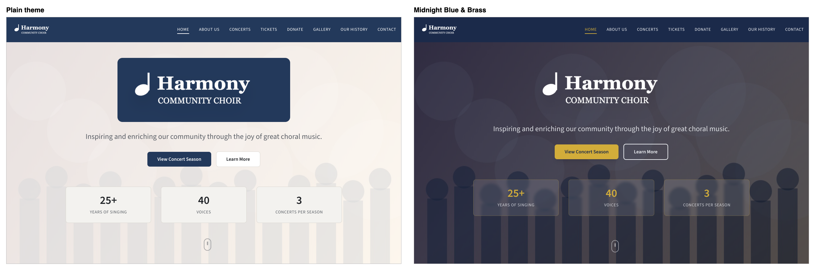
Plain is the only theme built on one colour. The other fourteen each use a palette of four colours, which gives the site a dark, coloured top and footer. The difference is described in Change your colours.
Every colour and font behind these names is listed in Themes, palettes and font pairings.
Check it in the preview
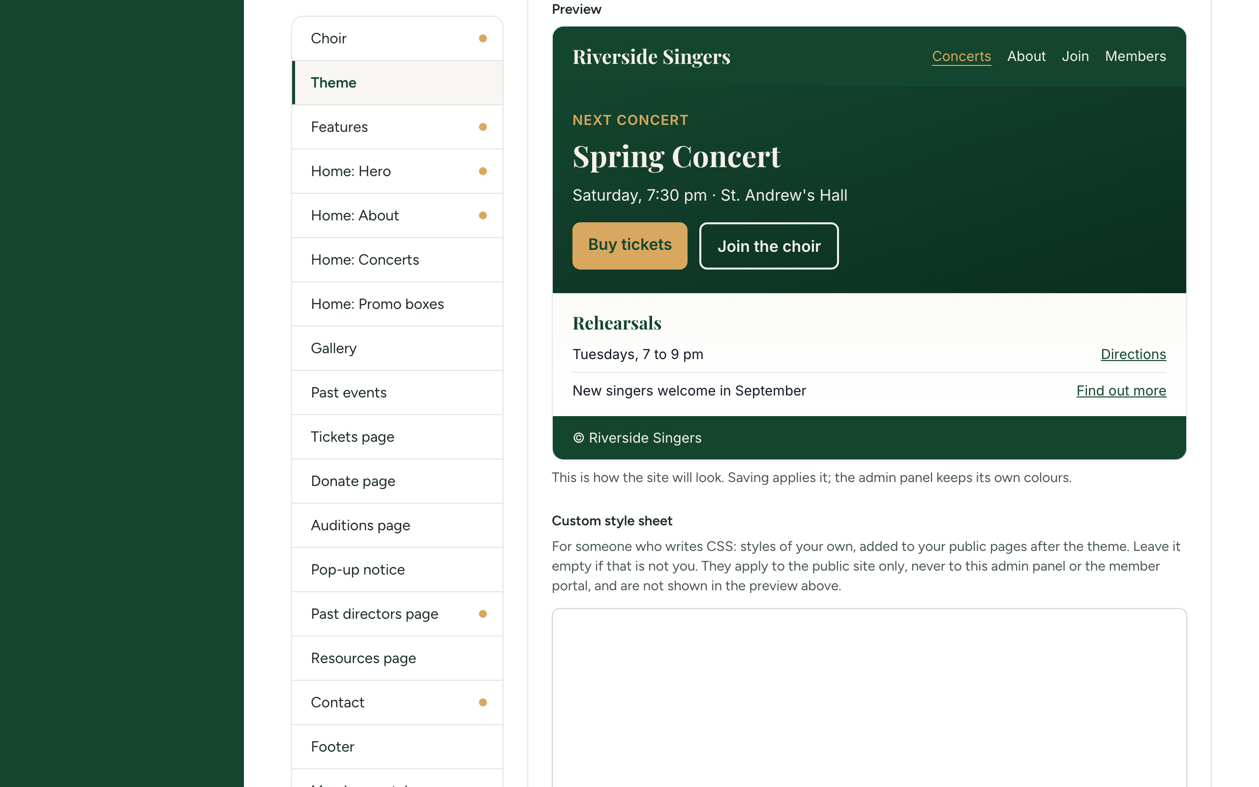
Under Preview is a small made-up page for a choir called Riverside Singers: a menu bar, a concert with two buttons, a light section with links, and a footer line. It is drawn in the colours and fonts you have selected, and changes as you select others.
Under it is the reminder: "This is how the site will look. Saving applies it; the admin panel keeps its own colours."
The admin panel never takes on your theme. It always wears the colours of Choir Master CMS itself, so that it looks the same whatever you choose. Your theme is used on the public site and in the member portal.
After saving, select View site at the top of the section to see the real thing. A page you already had open picks up the new theme when you reload it or come back to its tab.