Change your colours
Your site's colours are one of two kinds: one colour on white pages, or a palette of four colours with a dark top and footer. Both are chosen in the Theme section of Site Settings, under the ready-made themes. Choosing colours here leaves your fonts as they are.
How the two kinds look
| One colour | A palette of four colours | |
|---|---|---|
| The menu bar | A band of your colour, with white lettering | The dark main colour, with the second colour picking out the current page |
| The top of the home page | White, with dark lettering and the main button in your colour | Filled with the dark main colour, with light lettering and the main button in the second colour |
| Headings | Dark grey | The dark main colour |
| Buttons and links on the pages | Your colour | A mix of the main and second colours |
| Every other section of the home page | A fixed pale grey | A pale wash of your light tint |
| The footer | White, under a thin line | Filled with the dark main colour |
A one-colour site reads as plain and light. A palette site reads as rich and coloured.
One colour
On screen this part says: "White pages, with one colour for the header, buttons and links."
- Go to Site Settings → Theme.
- Under One colour, select Midnight, Burgundy, Plum or Charcoal, or select Your own colour. The one in use says Chosen.
- Check the Preview further down, then select Save.
| Colour | Code |
|---|---|
| Midnight | #23395b |
| Burgundy | #7a1f2b |
| Plum | #4e2a55 |
| Charcoal | #33373d |
Use a colour of your own
- Select Your own colour. A box of the same name appears underneath, holding the colour you last put there (Midnight's blue, to begin with).
- Select the coloured square to open the colour picker, or type the colour's code, such as
#1f4e79, in the box beside it. If your choir has a brand colour, its code is what to ask your designer or printer for. - Check the Preview, then select Save.
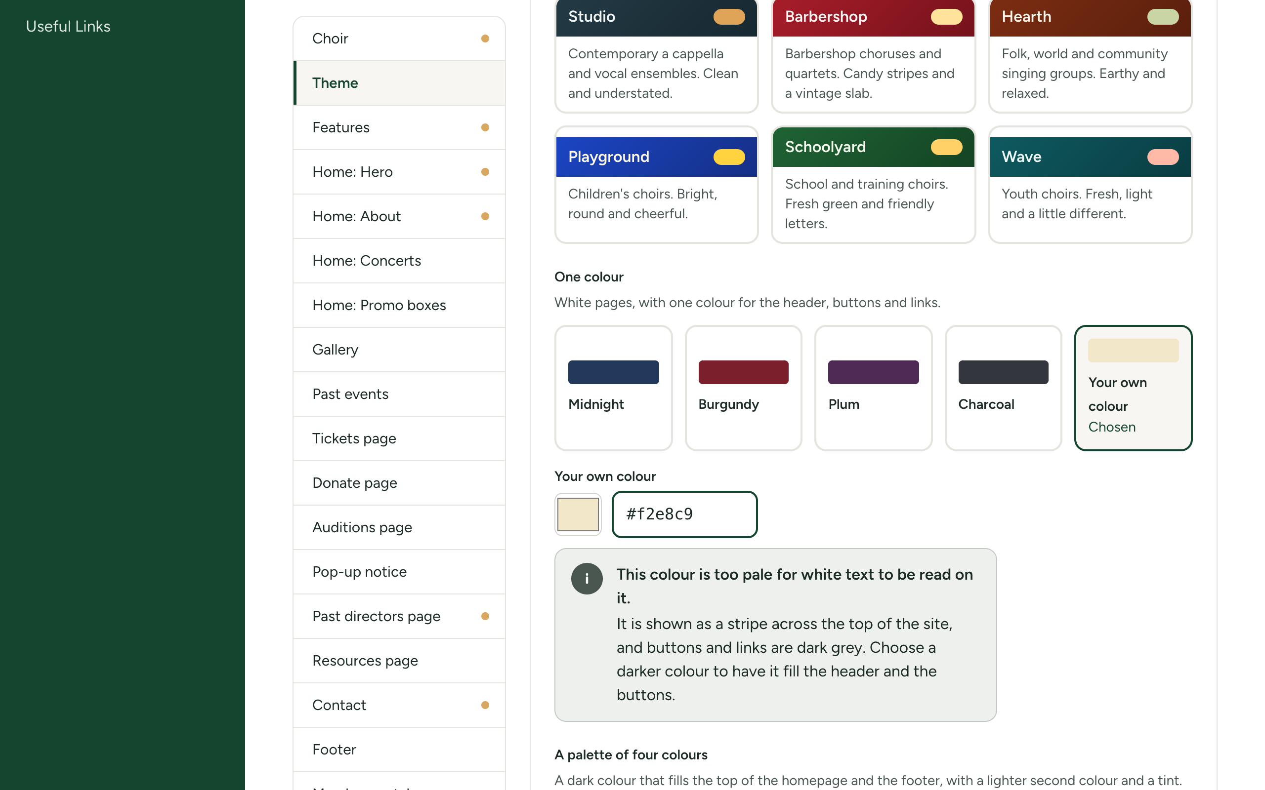
If your colour is pale
White lettering has to be readable on your colour, because the menu bar and the buttons are filled with it. If your colour is too pale for that, this notice appears under the box:
This colour is too pale for white text to be read on it. It is shown as a stripe across the top of the site, and buttons and links are dark grey. Choose a darker colour to have it fill the header and the buttons.
Your colour is never refused. You can save it, and your site then has:
- a thin stripe of your colour across the very top;
- a white menu bar with dark lettering;
- dark grey buttons and links;
- your colour in the short line under each heading.
If you would rather have your colour fill the menu bar and buttons, pick a darker shade of it. The notice goes away as soon as the colour is dark enough. Yellows, light blues, pinks and pale greens are usually too pale; navy, burgundy, forest green and most purples are fine.
A palette of four colours
On screen this part says: "A dark colour that fills the top of the homepage and the footer, with a lighter second colour and a tint."
- Go to Site Settings → Theme.
- Under A palette of four colours, select a palette. Each shows its four colours in a row above its name.
- Check the Preview, then select Save.
There are 17 palettes:
| Evergreen & Gold | Midnight Blue & Brass | Burgundy & Champagne |
| Deep Ocean & Amber | Plum & Honey | Slate & Copper |
| Charcoal & Gold | Ink & Silver | Stone & Candlelight |
| Royal Purple & Gold | Neon Night | Curtain Red & Spotlight |
| Sky Blue & Sunshine | Meadow & Buttercup | Lagoon & Coral |
| Candy Stripe | Terracotta & Sage |
Each has been checked so that the lettering is readable on the colours behind it. The four codes of every palette are in Themes, palettes and font pairings.
Evergreen & Gold are also the colours of Choir Master CMS itself, which the admin panel wears. You may use them; your public site and your admin panel will then simply look alike.
What the four colours are used for
| Colour | Used for |
|---|---|
| The dark main colour | The menu bar, the top of the home page, the footer, dark panels such as your leaders' cards, and headings. White and pale lettering sit on it. |
| A darker shade of it | The far end of the gradient wherever the main colour fills an area. |
| The second colour | Buttons, highlights and icons on the dark areas. Lettering in the main colour sits on it. |
| The light tint | The background of light sections and boxes. |
Four colours of your own
- Under A palette of four colours, select Four colours of your own, the last choice. It starts from the four colours of whatever you had selected, so pick the nearest palette first.
- A part called Four colours of your own appears underneath with four boxes. Set each with the colour picker or by typing its code.
- Check the Preview carefully, then select Save.
| Box | What to put in it |
|---|---|
| Primary (dark) | Your dark main colour. White lettering sits on it, so keep it dark. |
| Primary, darker (gradients) | A darker shade of the same colour. |
| Accent (buttons, highlights) | Your second colour. Lettering in the primary colour sits on it, so keep it mid to light. |
| Light tint (backgrounds) | A very pale colour, close to white. |
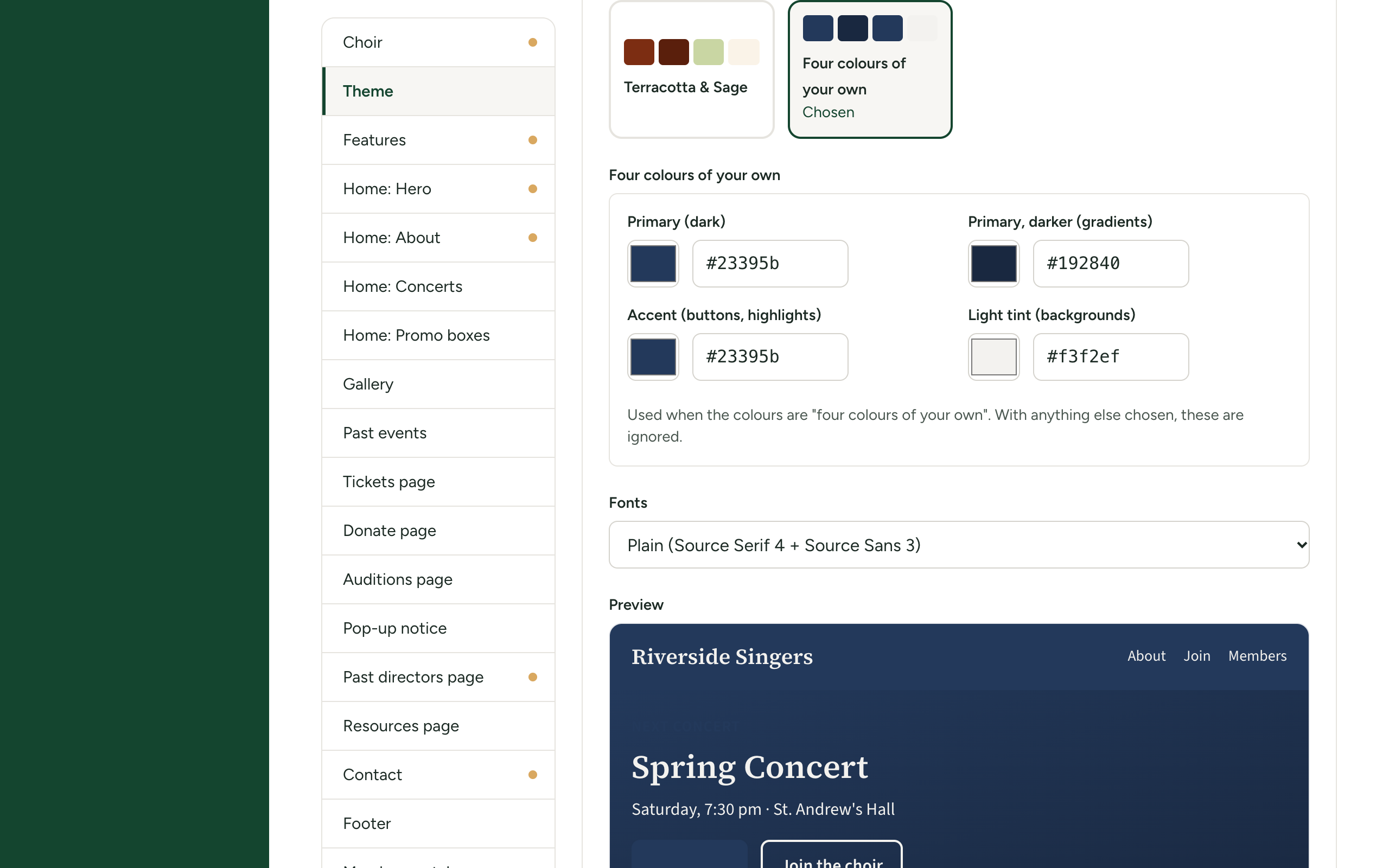
Under the boxes it says: 'Used when the colours are "four colours of your own". With anything else chosen, these are ignored.'
Selecting Four colours of your own always starts from the colours of whatever was selected just before. If you switch to a ready-made palette and later come back, your earlier four colours are not brought back, so keep a note of their codes.
The ready-made palettes are checked for readable lettering. Four colours of your own are not: the site uses whatever you give it. A bright or pale Primary makes white lettering unreadable across the whole site. Look at the menu bar, the buttons and the headings in the Preview before you save. A box left empty takes its colour from the default theme.
Where else your colours appear
- The member portal wears the same colours as your public site.
- The button in login emails is filled with your main colour.
- The admin panel does not change.
If something goes wrong
| Message | What to do |
|---|---|
Your own colour: must be a colour such as #1a2b3c | The code is not a colour. Use the colour picker, or type # and six figures or letters from a to f. |
Custom colours.primary: must be a colour such as #1a2b3c | The same, for one of your four colours. The last word says which: primary is Primary (dark), primaryDark is Primary, darker (gradients), accent is Accent (buttons, highlights) and cream is Light tint (backgrounds). |